Interactive Vs. Static: Which Data Visualization Style is Right for Your Business?
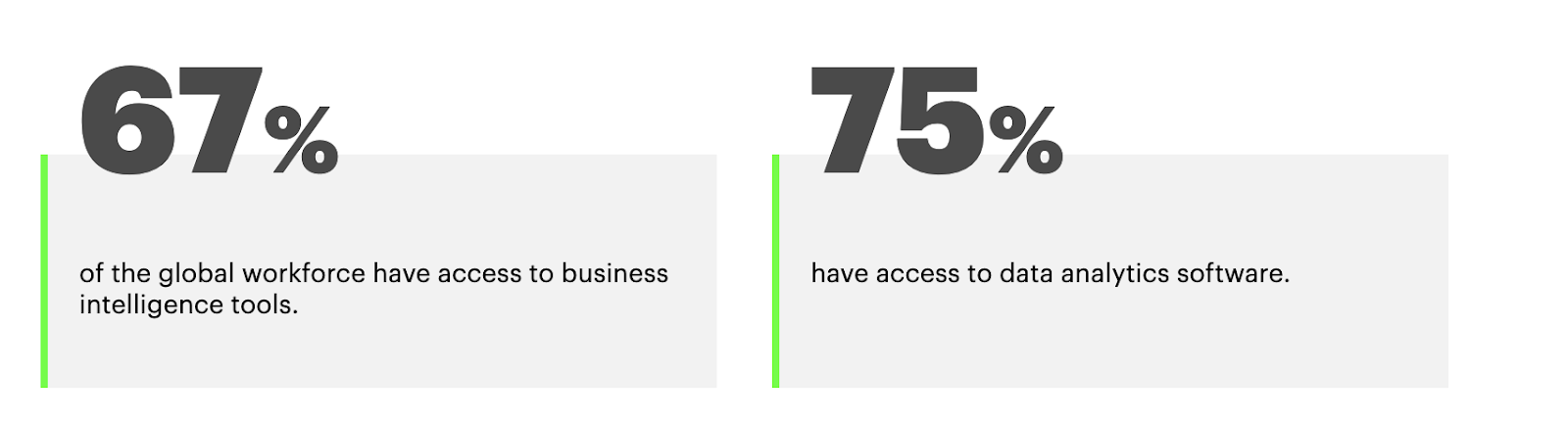
In an era where businesses are constantly racing to leverage data for a competitive edge, the tools they employ to visualize and decipher this data are of paramount importance. One central tool in this pursuit? Data visualization software.
Definition and Understanding
Before diving deep, let’s shed light on the foundational question: What is data visualization? At its core, data visualization transforms vast and complex data into visual formats that are easier to understand, such as charts, graphs, and maps.
Static Data Visualization: Static visuals, like printed charts or bar graphs in reports, offer a snapshot of data at a particular point in time. Many rely on simple tools like Excel or print features in more advanced platforms like Tableau.
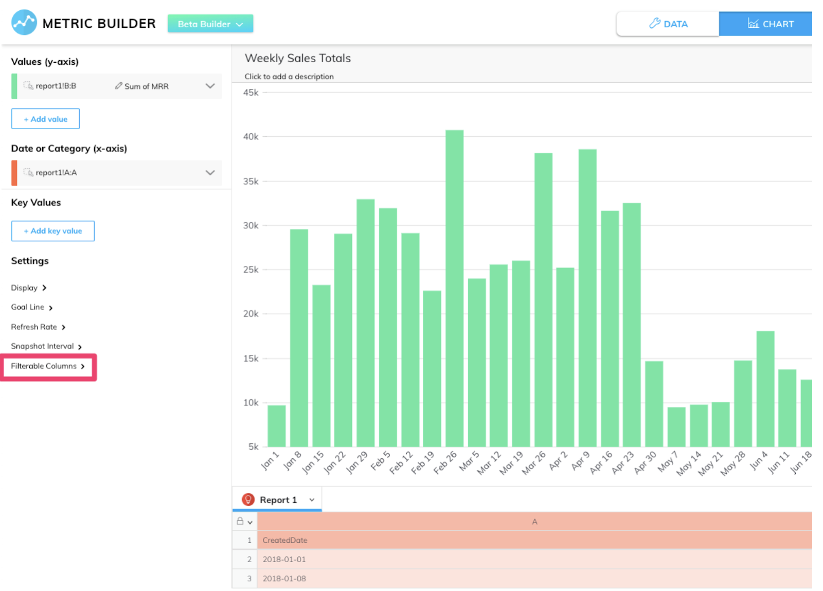
Interactive Data Visualization: Interactive visuals, on the other hand, are dynamic. Picture a data visualization dashboard where you can click on elements to drill down into more detailed information, or interactive maps that change as new data flows in. This is what Grow’s Expanded View offers. You can even apply real-time filters on metrics, getting the most granulated view of your data possible.
Advantages and Limitations
Static Data Visualization:
Advantages: Static visuals shine in their simplicity, providing a clear and unchanging image that's easy to interpret. They're consistent, making them reliable for presentations where the same message needs to reach multiple people. Plus, they're print-friendly, an undeniable advantage for traditional reports.
Limitations: However, they don't allow users to explore data layers or get updates in real-time, which can render them outdated in fast-changing scenarios. The lack of interactivity might also lead to decreased engagement.
Interactive Data Visualization:
Advantages: Interactive business intelligence data visualization platforms provide depth and flexibility. Users aren’t just passive consumers; they can actively engage, diving into layers of data or even updating it in real-time. The very nature of interactive visualization ensures a higher degree of user engagement and curiosity.
Limitations: But with great power comes challenges. The complexity might be a bit much for some users, leading to a steep learning curve. Relying heavily on specific data visualization software might lead to tool dependency. And with vast data sets, performance issues like loading lags can be a concern.
Factors to Consider When Choosing
Your audience is a significant determinant. While enthusiasts might revel in the complexities of an interactive dashboard, others might find solace in the simplicity of static visuals.
The purpose of your presentation also matters immensely. A quick quarterly sales update might be best suited for a static chart, but an in-depth data analysis session screams for interactivity.
It's also essential to consider the volume and complexity of your data, as large sets might be best explored interactively.
Lastly, consider your infrastructure. Do you have the necessary tools for creating interactive visuals, or are you better equipped for static imagery?
Case Studies
A. Retail Business Use Case:
Imagine a retailer preparing for a quarterly sales presentation. Static visuals can beautifully illustrate past performances. However, when it comes to predicting sales trends or checking real-time stock inventory, an interactive business intelligence data visualization dashboard offers unparalleled depth.
B. Healthcare Use Case:
In healthcare, while annual health report data might be best represented statically, imagine the power of an interactive tool that tracks real-time patient vitals or maps a disease outbreak!
Balancing Both Worlds
It's not always a binary choice. Some businesses integrate both, offering interactive dashboards with options to generate static reports. This approach offers flexibility, catering to a wide range of needs.
For instance, facing scattered data challenges, RedShelf implemented Grow software for its powerful interactive data visualization dashboard. Quickly, they combined multiple data sources into unified metrics, enhancing transparency and decision-making across the organization.
Conclusion:
While the power of interactive data visualization is undeniable, static visuals still have their space, especially in contexts where simplicity and consistency reign supreme. Businesses must introspect on their needs, audience, and available resources before choosing.
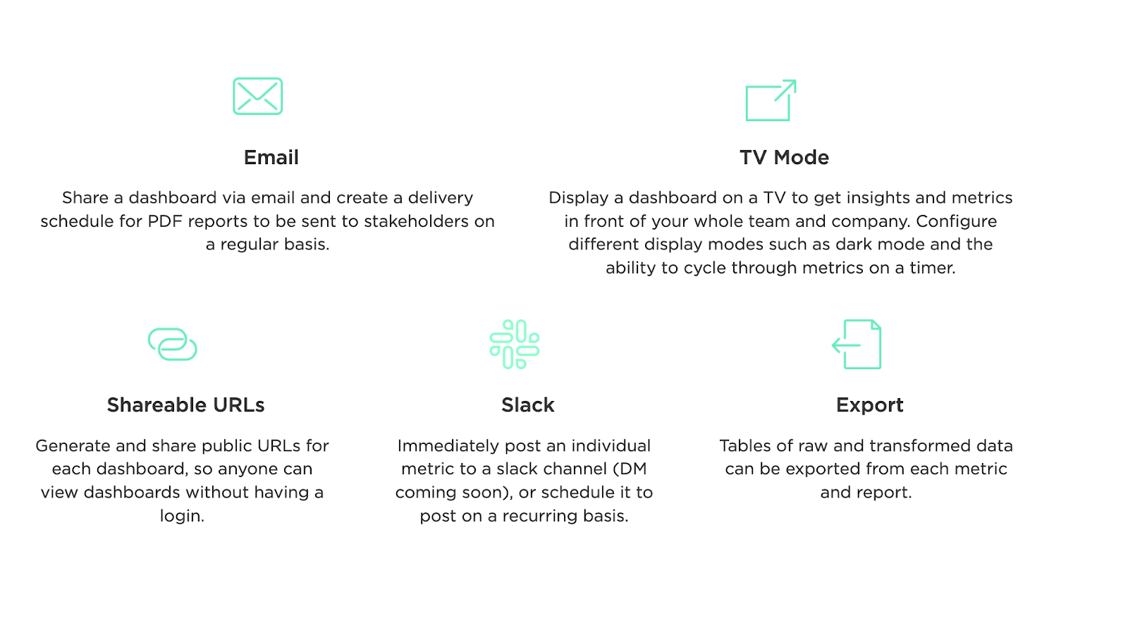
As you think about these needs, remember that tools like Grow can offer various solutions to meet these needs.
Eager to understand more? Dive into Grow Features & Capabilities GetApp and discover why so many businesses trust and rave about its capabilities.
Has this ignited your interest in data visualization software? Share your experiences or reach out to explore how you can leverage business intelligence data visualization tools tailored to your needs. Whether it's a static image or a dynamic dashboard, make sure your data tells the story you want!

Comments
Post a Comment